Terraria 1.4.3 mobile rant

Terraria 1.4.3 mobile was a good adition to terraria mobile BUT and there is a big BUT , the controls just suck balls like so hard like every other content drop is fine dst crossover , princess items, etc, but my god they fucked up the ui by alot

1st offender of the ui: it was designed for console and in no way mobile
First thing that shows this is the obvious screen being so goddamn large and everything being new arranged and all of this dosent plag well on a touch screen but perfectly on a controller

2nd offender of the controls:the game already had controversial changes like 1.2 to 1.3 having a control remake 1.2 players hated it and new people enjoyed it then 1.4 came but no change… Until now and my god it just hurts my muscle memory like speak for urself but it just fries my brain everytime i think about it

For most part my rant is that this version is not well optimized for mobile and looks more like a console port other then the other way around but its still terraria and its still a great game just want relogic to fix this

11 Likes

I have a few simple problems with mobile 1.4.3.

• The Inventory button. Also applies to the Settings button; previously, I could just hit either with my thumb straight off the joystick, no hand movement required. Now, for a phone user this probably isn’t an issue, but I’m on iPad. And thus, the new placement of these two buttons requires me to take my thumb off the movement joystick, shift my attention upwards to make sure I hit the button (because they’re oddly spaced-out), move my hand up and hit the button. It’s a very minor thing that doesn’t even exist for well over half the playerbase and it annoys me to no end.

• No more shifting screen. Previously, when you talked to NPCs or opened your inventory, the view would slide upwards a bit so you could see your character and such. Now, talking to NPCs causes their text boxes to completely cover the center of your screen with no upwards shift, entirely obscuring your character. Not terrible until you talk to the Stylist and realise you can no longer review how your hair changes mesh with your actual vanity because the shop box is smack-dab in the middle of the screen and so is your character.

• Bottom-up chat. I used to use top-down. This is weird and I have not been able to get used to it. Also, when the chat window is closed it shows like the third-last message instead of the most recent.

• The killer: no customisation. For an update that released a huge number of UI reorganisation tools in Settings, it sure did a great job:
-settings and inventory buttons cannot be relocated
-the entire inventory group itself cannot be relocated
-they literally removed the option for top-down chat. It used to exist. They removed a UI customisation tool in an update that added UI customisation. Why…?

These are all somewhat minor grievances, but they add up to a truly annoying parity update. It’s incredibly odd to me that the devs decided to outright remove several quality-of-life features for no particular reason.

8 Likes

Here’s my rant, and it’s not just the controls:

1. New Armor Area

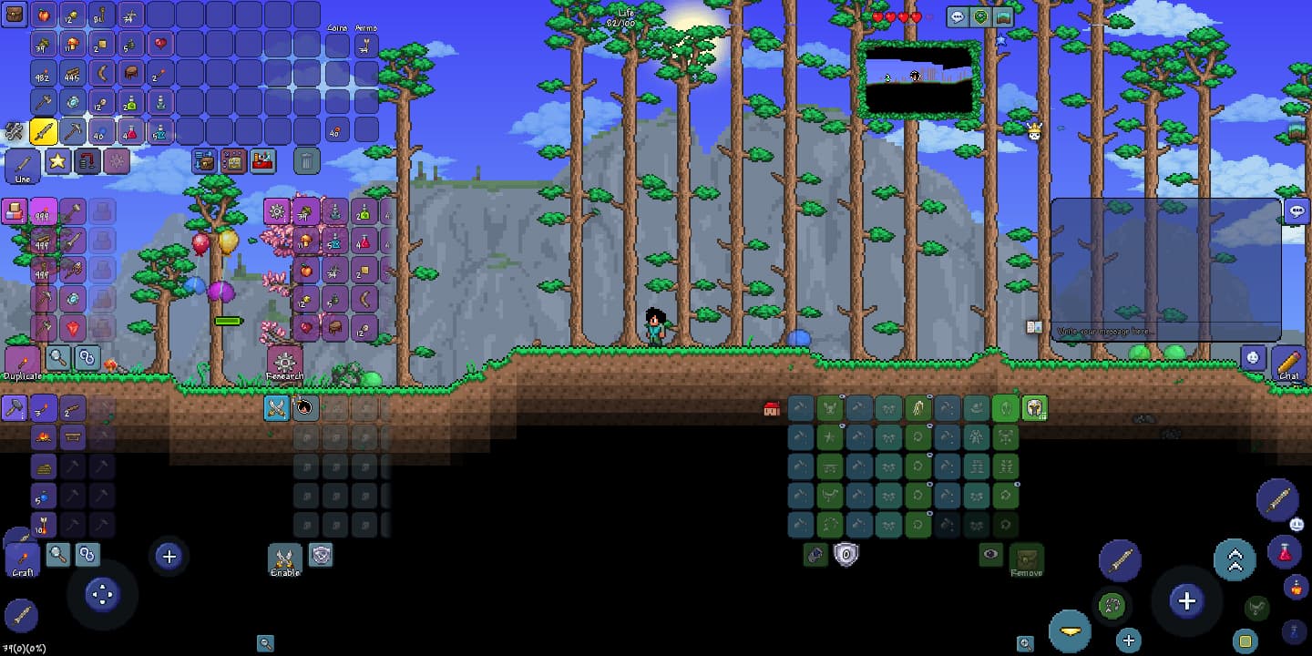
For clarification, I’m on iPad, but it’s gotta be a ton worse for phone users. The armor area is a cramped cluster of boxes that are hard to identify without looking closely. Also, the accessory slots added by the Demon Heart and Master Mode are UNDER THE ARMOR. This makes zero sense for a company called Re-LOGIC.

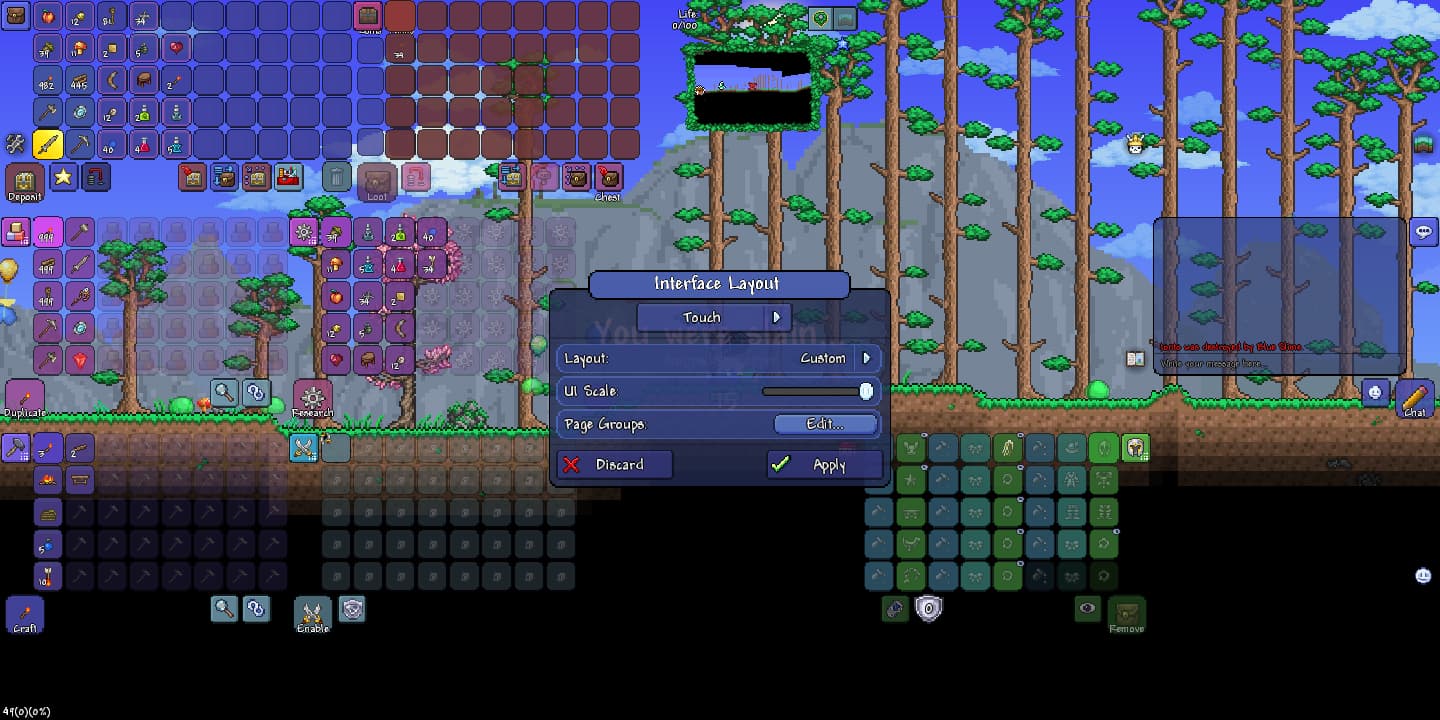
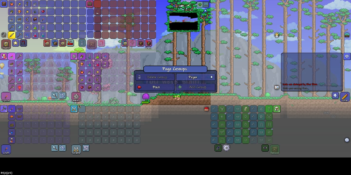
2. Relocation of Inventory Controls

I am so used to pressing all the inventory and settings open buttons at the bottom, now it just messes me up. Additionally, I use horizontal hotbar (for various reasons), the the inventory button now TAKES UP THE WHERE THE FIRST SLOT WOULD BE. Additionally, settings used to be super easy to reach.
Now, you gotta search for where it is SOMEWHERE gestures vaguely ON THE SCREEN.

3. Screen No Longer Slides Upon Opening Inventory.

I used to use this as a little tactic to see (when going underground) if the area above me was safe. I also sometimes used it to help find low sky islands. Now, I was super frustrated when I found out it didn’t slide. HOWEVER, I did find a way to arrange the UI in such a way that you can slide up. Unfortunately, that way is extremely visually unappealing and large, and it would mess me up even more. So, I don’t use it. I can still see my character tho, I like to keep my UI decently small.

4. Weird Chat Direction

Just a minor grievance, but I’ve gotten used to it. You no longer have the option to change chat direction, which is kinda sad.

And the killer…

Deerclops SUCKS!

The shadow hands are literally anti-skill. They appear randomly, from any random direction, they have zero pattern, and there’s no way to stop them because they go through walls. They suck. Deerclops is also both anti-skill, but he has an uncreative and repetitive AI. At least Duke Fishron has phases! Deerclops does nothing but summon more cancer hands as he loses more health, which is irritating. To say the least. Also, the only viable way to beat this boss at the time he’s actually useful is by cheesing` him. It’s kinda the same case with dreadnautilus, but at least dreadnautilus is intended to be fought pre-mechs. Deerclops is meant to be post-skeletron, a point in the game at which his drops are obselete and underpowered. His fight is slow, annoying, and easily cheesable at once, and I hate it.

Now, I will never complain about the 1.4.1 balance changes and added items. That was awesome. The other DST items are also cool. However, I just feel like Re-Logic screwed the controls up so badly. The layout was clearly meant to reflect Console or PC, but Mobile doesn’t work that way. Just leave our controls alone for one update, Re-Logic xD

9 Likes

Technically, Deerclops isn’t a true boss, it’s just a miniboss because it is not exactly essential to kill to progress. I know that AI’s are sometimes difficult to code, especially for an enemy such as Deerclops. Such as, some bosses in the OOA dont have many attacks and just walk forward, accepting fate. Nyes, I do understand you expected more from ReLogic on Deerclops but we must be thankful that they at least took time to make it. Who knows, they could improve its AI in 1.4.4!

9 Likes

Honestly I prefer the new controls and UI it has helped me with screen clutter issues and slightly helped my movement issues but only slightly.

9 Likes

I know I am going to be the only one to say this so go ahead and blast me for it everyone I know does so you might as well.

9 Likes

Actually, I do see where you’re coming from… This new UI system does give more customization in the sense of menus but for things such as pausing and opening the inventory, thats a bit different. Now, you have to assign completely different buttons to move them from the top left menu. But I do agree, this new UI system does allow more flexibility at the cost of moving buttons that were originally comfortable!

8 Likes

Oh, I forgot that one. It’s disgusting. You can’t even change it by altering the size of the group or anything, it’s just permanently stuck like that.

Actually, don’t the shadow hands appear in the direction you’re moving? Which is why the minecart track cheese works; the hands think you’re moving in one direction and spawn in front of you, then you get bounced back in the other direction immediately because it’s a tiny track. It’s kind of like the Moon Lord’s snipe attack in that way, except the window to react is half as large, the projectiles themselves are three times as large and they aren’t telegraphed whatsoever.

Okay, so slightly unfair to do that for how mediocre the rewards are. Still, the hands give you a window to react as they appear—it’s kind of like phase 2 BoC in that way. Since you’re just about guaranteed to have SoC equipped at the point of fighting Expert+ Deerclops, the hands may be a tall order but they’re not quite impossible to handle.

This is pretty true. Somewhat off-topic, but I have (or had? given the buffs in 1.4.1+) a similar issue with EoL’s drops in 1.4: all outshined by Duke’s but gated behind a more difficult fight. Terraria balance past 1.4 has been pretty wack at times (let’s nerf Titanium Armour but oh wait we actually made it stronger) which is probably why the devs have been asking for balance opinions or implementing buffs and nerfs every single update after it.

7 Likes

Let’s send this topic link to Terraria devs.

6 Likes

I don’t have an issue with the UI, since I use keybinds, but even with the new update key switching seems majorly slowed down, even with 1-0 keybinds. Not sure why and it’s super annoying; I haven’t really played DG at all since the update.

6 Likes

How many new UIs you want?
Yes


Also, for some reason the HP numeric indicator is in the top middle of the screen, instead of the top right, like the hearts

8 Likes

the way relogic intended it

7 Likes

I think this is a error with your resolution due to your physical screen size. This looks very different than the way it does on my device.

7 Likes

I’m pretty sure it was a jab at how stupid the new controls are, not legit lol

7 Likes

Nah
Im just messing around with the new custom options to do cursed things like:
Left side healthbar

7 Likes

That, to say, is beyond cursed. I didnt even know you could move that window! Try putting it in the top-center of the screen! This customization excites me!!

4 Likes

Vertical terraria

Bottom text
I made this by messing around with the new UI config files, i dont know exactly how , but just happened

7 Likes

Moving looks like a nightmare with that, and the buttons are pretty dang small Im impressed you still managed to fight the boss with minimal screen vision. Heck what a chad but still the FBI is looking for you :confused:

6 Likes

Oh that vision is like seeing a mile compared to what it used to be before 1.3… That vision was horribly small…

4 Likes

Oh trust me, I use mobile, and it has jacked up my muscle memory, and all that I liked about mobile, it basically removed the hood qualities of playing mobile

3 Likes