The Trading System User Interface is not very user friendly right now. I suggest that it gets made more user friendly.
Here is a list of all of my complaints about it, and my suggestions on how to fix it:
Earning XP and DP
The current experience system is not at all intuitive. For those who don’t understand, let me explain:
To gain experience, you need to fulfill 2 requirements:
- You must have some percentage of XP Efficiency.
- You must play online and do actions that grant XP.
The problem with this is that it doesn’t tell you about XP Efficiency unless you look at the FAQ, and so if someone doesn’t look at the FAQ, they won’t know why they stopped gaining XP.
But this is fine, right? You should look at the FAQ before using the system, right? Well, I agree that you should look at it, you shouldn’t be required to look at it to understand the Trading System.
I might have left it here if that was all, but there’s more: Even if you do look at the FAQ, the FAQ doesn’t tell you how to refill your XP Efficiency. So even if you do figure that the problem is XP Efficiency, you don’t know how to fix it.
But there’s more! Even if you do figure out XP Efficiency, you still don’t know how much it costs to refill it, because that part of it is broken.

Personally, I lost 1000 DP to this, which if you know how the system works, that might not be all that much; But since the system drains DP when you have 0 XP efficiency, it was all I had.
I’m just ranting right now though, so I should get on to ways this could be fixed:
- Fix the system that tells you how much you are paying to refill XP Efficiency.
- Add a pop-up or something that says something like “Your XP Efficiency is at 0%! Refill it or your DP will be drained rapidly!”. If you feel this would be too annoying for older players who already know this, then a way to turn off the Pop-Up could be added.
- Make it so that you can see the XP Efficiency Refill options at all times, instead of just when you hover over the bar.
Aesthetics
Currently, my Inventory looks a little something like this:
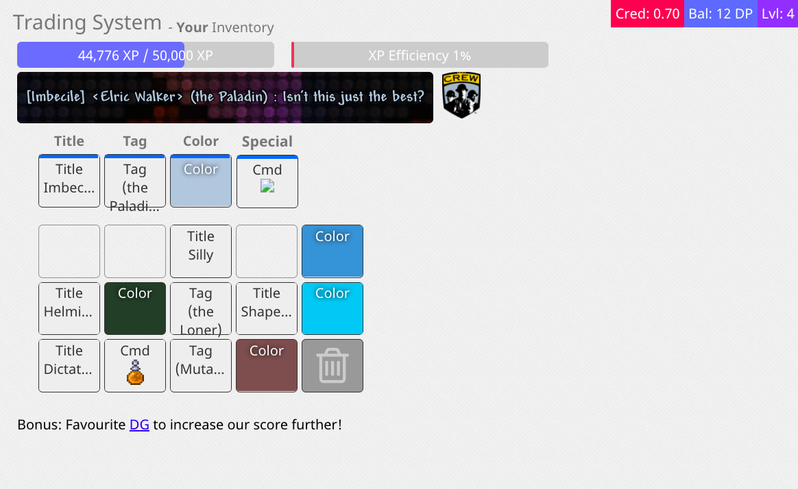
I’m going to be honest here, this doesn’t look very good.
For one, you’ll notice that a lot of the item names don’t fit inside the inventory boxes, to the point that some of them are even cut off with a “…”. This isn’t too much of a problem on the inventory screen, because you can hover over the boxes to figure out what they are, but in the store, often you just have to guess what the end of titles or tags are.
My suggestion for this are:
- Make it so that if text doesn’t fit in the box, it decreases the font size until it does fit in the box.
- Change the background color from white (While keeping the inventory slots White) because that adds contrast and would just make everything look so much better (I suggest shade of light brown)
Timers
This is something I think the designers of the system tried to implement, but failed to do so: The Timer feature on Titles and Tags.
- It doesn’t work. If you reload the page, the timers reset, and even if you wait for the timers to run out before reloading the page, the items you loose just come back.
- It is not a good system in the first place.
My suggestion is to remove it entirely.
Here are some reasons why:
- Nobody wants to loose their titles after 3 hours, especially with how hard it would be to get them back afterwards
- Without the timer system, the “Not Enough Sleep” type items (which are currently useless) would no longer exist, thus loot boxes would give better loot, and thus giving people more incentive to vote.
These are just the basic things that could be done. I am aware that there are more sections which I cannot see that probably have issues as well.
I understand that this would be a big change, and would probably take time, but the first step in fixing a problem is to identify that the problem exists and possible ways to fix it.
Quick note at the end here, because I was reviewing and editing this and I realized that a lot of what I was saying sounded harsh, to the point I am still hesitant to post this: I am not trying to insult anyone who helped design the system, just pointing out problems and possible solutions ![]()
