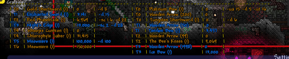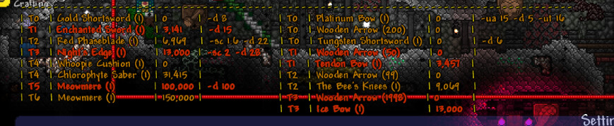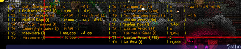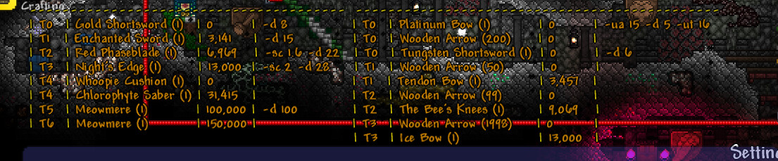
Its hard to tell which tiers are which without looking at the tier coloum, which is kinda inconvinient at times.
Mockup of the new idea
Mockup of the new idea
imo the first one looks best, the second looks indistinguishable and the third has too little constrast
personally for me, 1st is worst and 3rd is the best
so make it customisable
honestly i think 3rd looks best, like Nether said, maybe customizable?
3rd is worst for me, 2nd is the middle, and 1st is best cuz it has the highest contrast withe everything else ;p
imo, i’d just pick one and stick with it, it’s not worth adding a setting
you know what, i think the first one is the best (yellow + blue)
add option to choose between 2, that should be easy enough to do, i think